How to create an elegant wedding invitation without hiring a graphic designer
Learn how to create an elegant wedding invitation without a graphic designer. 5 design principles + how to get started with a professional template.
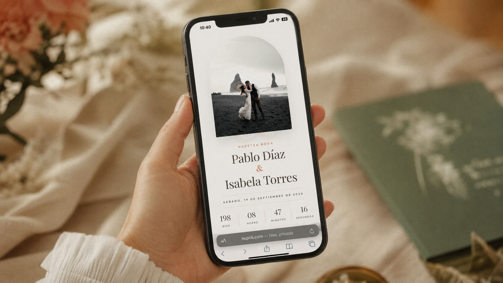
When you start planning a wedding, one of the first questions that comes up is the invitation. And it almost always comes with a weightier question attached: "Do I need to hire a designer to make it look beautiful?"
The short answer is no. The long answer is what we're going to unpack in this article.
An elegant wedding invitation doesn't depend on a graphic designer — it depends on following a few basic design rules and starting from a solid foundation. Once you understand what makes an invitation look professional, you can pull it off yourself, in less time and for a fraction of the price.
🤔 Why you think you need a designer (and why you probably don't)
The idea that an elegant invitation requires a professional designer comes from a time when everything was printed. On paper, any mistake gets expensive: a bad line break, a poorly chosen typeface or a color that doesn't print the way it looks on screen can ruin 150 invitations at once.
That's why many couples assumed they needed someone with experience. And it made sense back then.
Today the picture is different. Most invitations are delivered digitally, and there are professional templates built by design teams that adapt to your information in seconds. What used to cost between $150 and $400 USD in design is now solved by choosing a template well and personalizing it with taste.
The only thing you need is to understand five principles.
🎨 The 5 design principles that make an invitation elegant
These are the criteria any professional designer applies — and that you can apply too.
1. Clear visual hierarchy
An elegant invitation has a natural reading order. When a guest opens it, their eye should go straight to what matters most (the names and the date), then to the event details (venue, time) and finally to the secondary details (dress code, gifts, RSVP).
The way to achieve this is by playing with the size and weight of the text:
- The couple's names should be the largest element
- The date, the second most important
- The ceremony and celebration details go in a medium size
- The secondary details, in small text
If everything on your invitation is the same size, it looks flat. If it has hierarchy, it looks professional.
2. Typography: two fonts maximum
This is the most common mistake. Mixing three, four or five typefaces because "they all look pretty" breaks the elegance immediately.
The rule is simple: one decorative typeface for the names (it can be calligraphic, an elegant serif or a modern one) and one clean typeface for the rest of the text (a sans-serif or a legible serif).
That's it. Two well-paired fonts look more elegant than five "interesting" ones.
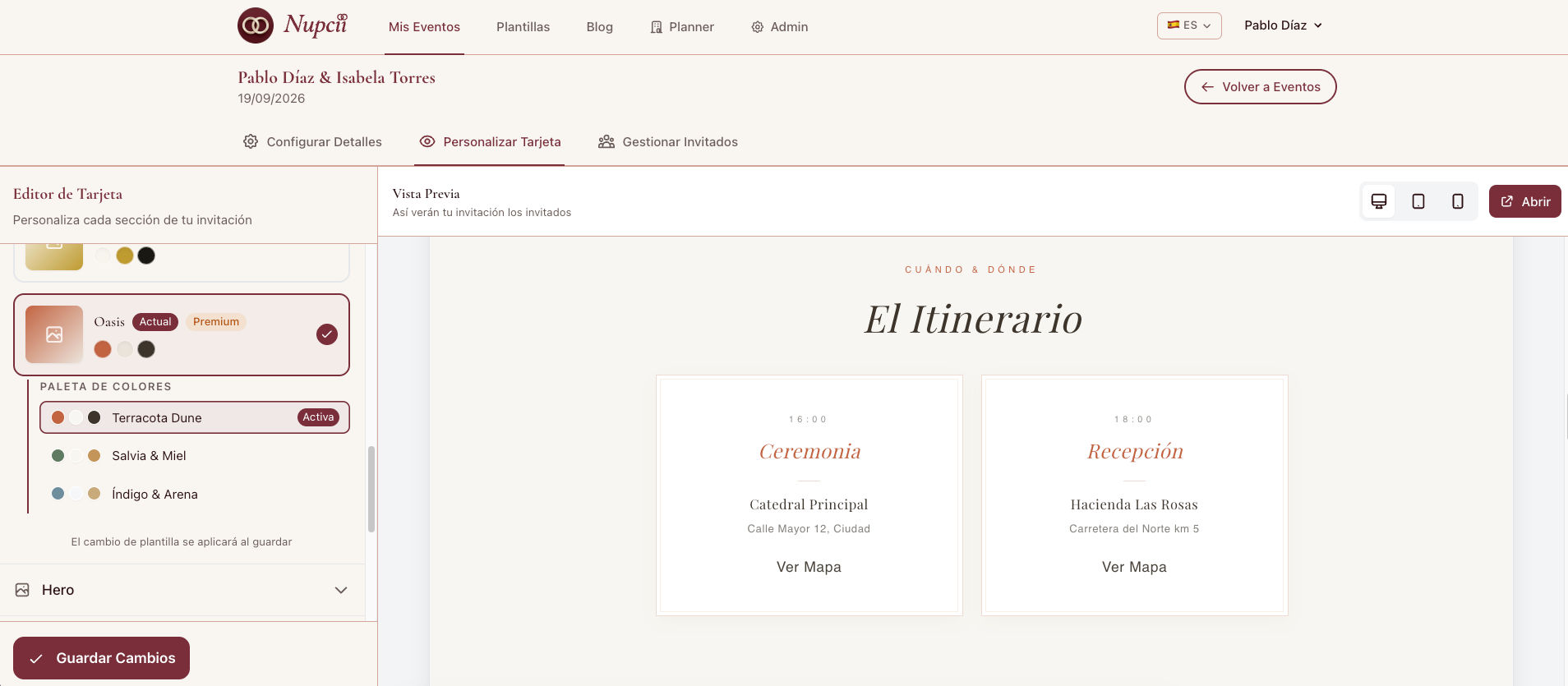
3. A harmonious color palette
An elegant invitation uses between three and four colors that talk to each other. It's not about choosing the colors you like most individually — it's about choosing colors that work together.
The palettes that age best and look most sophisticated tend to be:
- Neutrals + one accent: beige, off-white, light brown + a touch of olive or terracotta
- Earth tones: sage, soft mustard, blush, cream
- Timeless classics: ivory, champagne gold, black
Avoid combining more than one "bold" color. If your accent is a wine red, everything else should be neutral. If you want gold, let the rest breathe in white.
📸 
4. White space — don't fill everything
White space (also called negative space) is what lets an invitation breathe. It's the difference between something that looks cluttered and something that looks luxurious.
If you want your invitation to look elegant, leave space between the elements. Don't try to cram the family tree, the full menu, the story of how you met and the event details onto a single screen.
A digital invitation has the advantage of being able to run long without feeling heavy — guests just scroll. Take advantage of that: give each section its own space.
5. Visual consistency from start to finish
If the first section uses a certain icon style, all the others should use that same style. If the titles are in uppercase in the ceremony section, they should also be in uppercase in the celebration section.
Small inconsistencies ruin the sense of elegance faster than anything else. An elegant invitation feels like a single piece.
💡 Nupcii Tip: If you're torn between two design decisions, always choose the simpler one. Elegance almost never comes from "adding more" — it comes from removing what doesn't belong.
⚠️ The 3 mistakes that give away an "amateur" look
If you want to know why some invitations look homemade, it almost always comes down to these three mistakes:
- Too many colors together. More than 4 colors and the elegance disappears.
- Fonts that don't match. A romantic calligraphic font next to an aggressive modern typeface doesn't work.
- No breathing room. Text stuck to the edges, sections with no separation, everything piled up with no visual rest.
If you avoid these three, you're already ahead of 80% of invitations made without guidance.
✨ The easiest way: start with a professional template
Here's the shortcut almost no one mentions: you don't have to start from scratch.
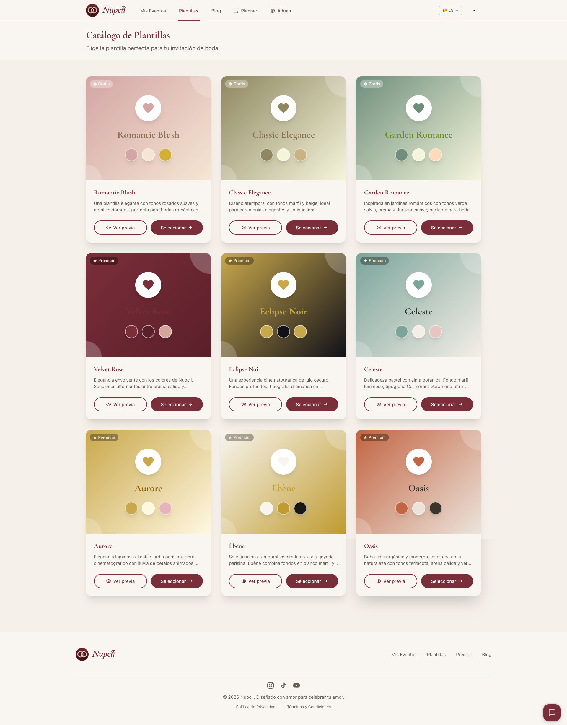
There are digital invitation templates designed by professional teams in which every visual decision has already been made. The hierarchy, the typography, the color palette and the spacing are all solved. Your only job is to replace the content with your own information.
It's exactly the same principle professional designers use when they work: they start with a base structure and adapt it. The difference is that now you can access that same structure without paying for hours of design.
At Nupcii, for example, each template comes with:
- A typographic hierarchy that's already thought out (the names stand out, the details read clearly)
- Font combinations validated by designers
- Three harmonious color palettes per template
- Spacing and margins optimized to look good on a phone
📸 
🛠️ How to personalize without breaking the design
Having a professional template is only half the journey. The other half is not ruining it during personalization.
Three rules for keeping the elegance while you're editing:
1. Respect the color palette that comes with the template. If the template is built around sage and cream tones, don't add an electric fuchsia just because it's your favorite color. Stay within the palette — it's designed to look good.
2. Don't replace the original fonts. The fonts were chosen for a reason. Changing them almost always makes the design worse.
3. Mind the quality of your photos. The cover photo is the first thing your guests will see. Use a well-lit, high-resolution photo where you're clearly visible as a couple. If you don't have a good one, it's worth doing a quick shoot — it'll come out cheaper than a designer.
📸 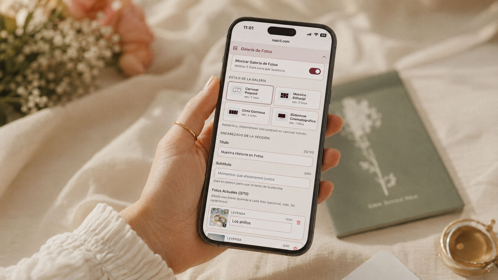
💡 Nupcii Tip: Before sending your invitation, open it on your phone and review it as if you were a guest. If something feels off to you, it'll feel off to whoever receives it too.
💭 What if I want something unique, not a template?
That's fair. But it's also worth understanding that "unique" isn't the same as "elegant." An invitation can be standard and look impeccable, or it can be super original and look chaotic.
If you want something truly personalized, there are two paths:
- Start with a template and customize the palette and the cover photo. With that, you already have a visually unique invitation while keeping the professional design.
- Delegate the work to a team that sets it up for you. Some platforms (Nupcii included, with its Experiencia VIP plan) offer this service: you provide the information, they build the invitation and you just approve it.
In both cases, you still don't need a separately hired graphic designer.
📋 In summary
Creating an elegant wedding invitation without a designer is possible if you:
- Apply the 5 design principles (hierarchy, limited typography, a harmonious palette, white space, consistency)
- Avoid the 3 typical mistakes (too many colors, fonts that don't match, no breathing room)
- Start from a professional template instead of starting from scratch
- Personalize with taste, without breaking what already works
An elegant invitation isn't measured by how much you paid for it. It's measured by the design decisions behind it — and those decisions are now within reach of any couple who knows where to look.
✨ Conclusion
Hiring a graphic designer for your wedding invitation was, for a long time, the only way to get a professional result — but today it's no longer the only way, nor the most practical one.
With the right principles and a good template as a starting point, you can create an invitation that looks just as elegant (or more) than a custom-made one, in a fraction of the time and for a fraction of the cost.
At Nupcii you can make your digital wedding invitation with professionally designed templates, harmonious color palettes and optimized typography — all already thought through so your invitation looks impeccable from the very first moment. With the Celebración plan ($19 USD, one-time payment) you get access to the premium templates, a music library, unlimited guests and direct sending over WhatsApp. No subscription, no surprises — you pay once and your invitation is yours.
✨ Because an elegant invitation doesn't depend on your budget — it depends on the right decisions.
Ready to create your invitation?
Start free today. No credit card required.
Create my invitation for free